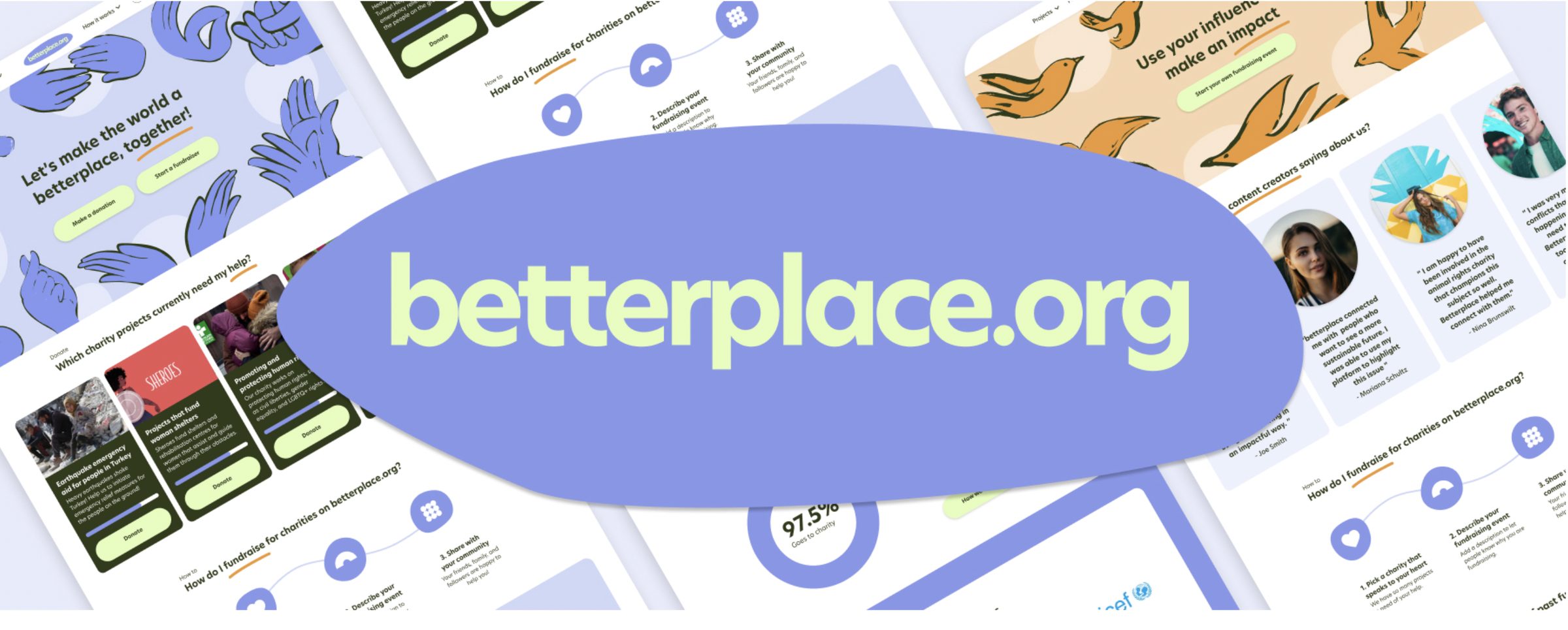
betterplace.org is Germany’s largest charity fundraising platform and operates as a not-for-profit organization. For our final project in the UX/UI Design bootcamp at Ironhack, I collaborated with my classmate (and now friend) Penelope to redesign the betterplace.org desktop website. Our redesign focused on the fundraiser event creation flow for ‘Content Creator’ users. We also refreshed betterplace.org’s brand identity with a new logo, illustrations, and a design guide.
Hi-Fi prototype
Open the Hi-Fi prototype in Figma and try creating a fundraising event as a content creator: click “Start a Fundraiser” on the homepage, or select “Fundraisers” from the dropdown menu.
Logo
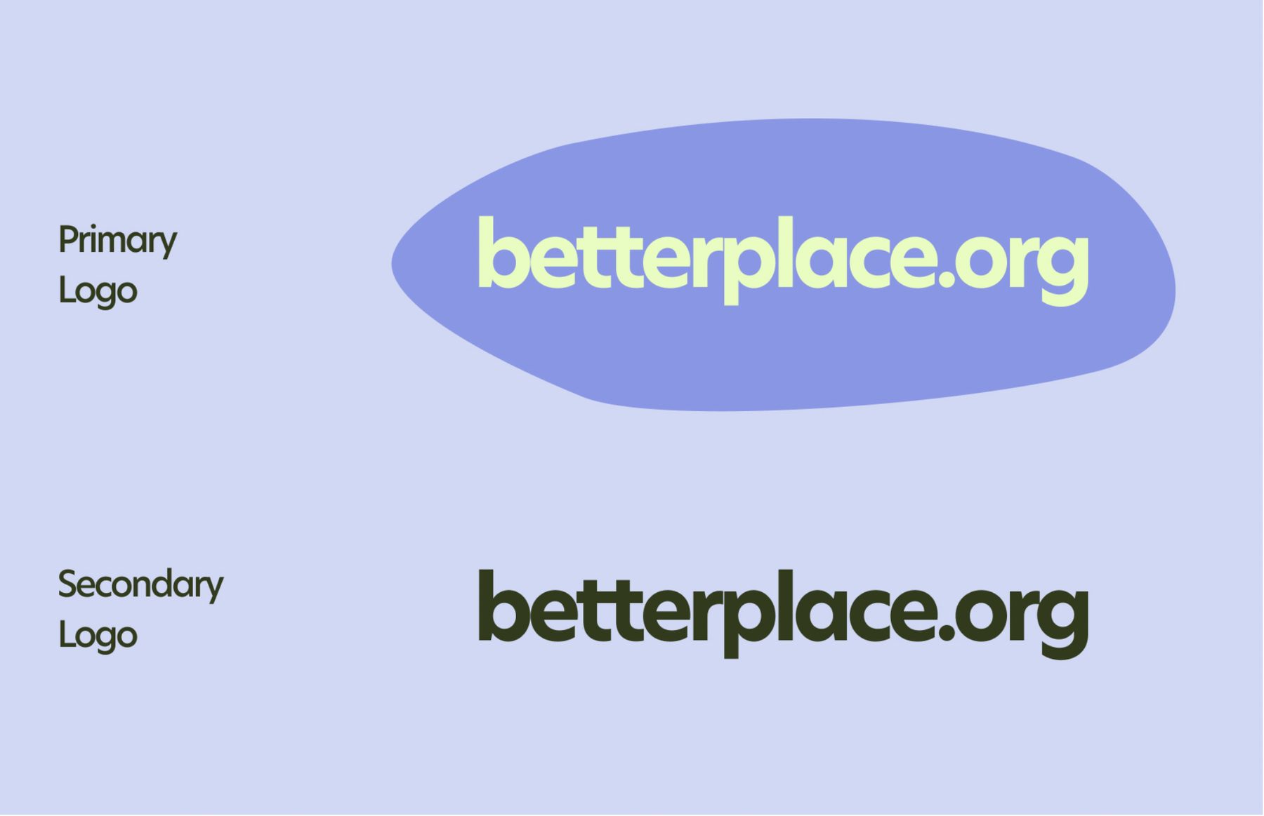
We created a primary and a secondary version of the logo. Our goal was a brand mark that felt clean and accessible, so we removed the heart symbol and gave all the letters a uniform font, size, and color. To emphasize connection and support, core values in betterplace.org’s projects, we placed the letters close together and added a blue organic shape in the background. The shape is intentionally uneven and imperfect, symbolizing the diversity and unpredictability of humanity.
Design guide
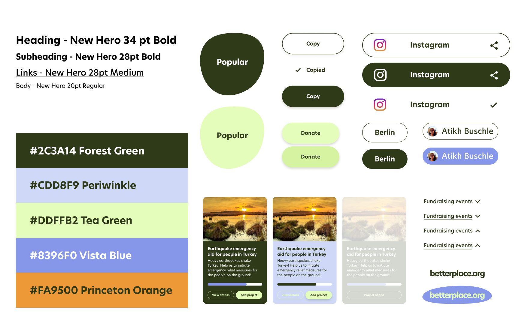
We created UI elements that are smooth, inviting, and easy to read, with default, hover, and active states for project cards, search filters, project categories, call-to-action buttons, navigation drop-downs, and account login indicators.
The brief
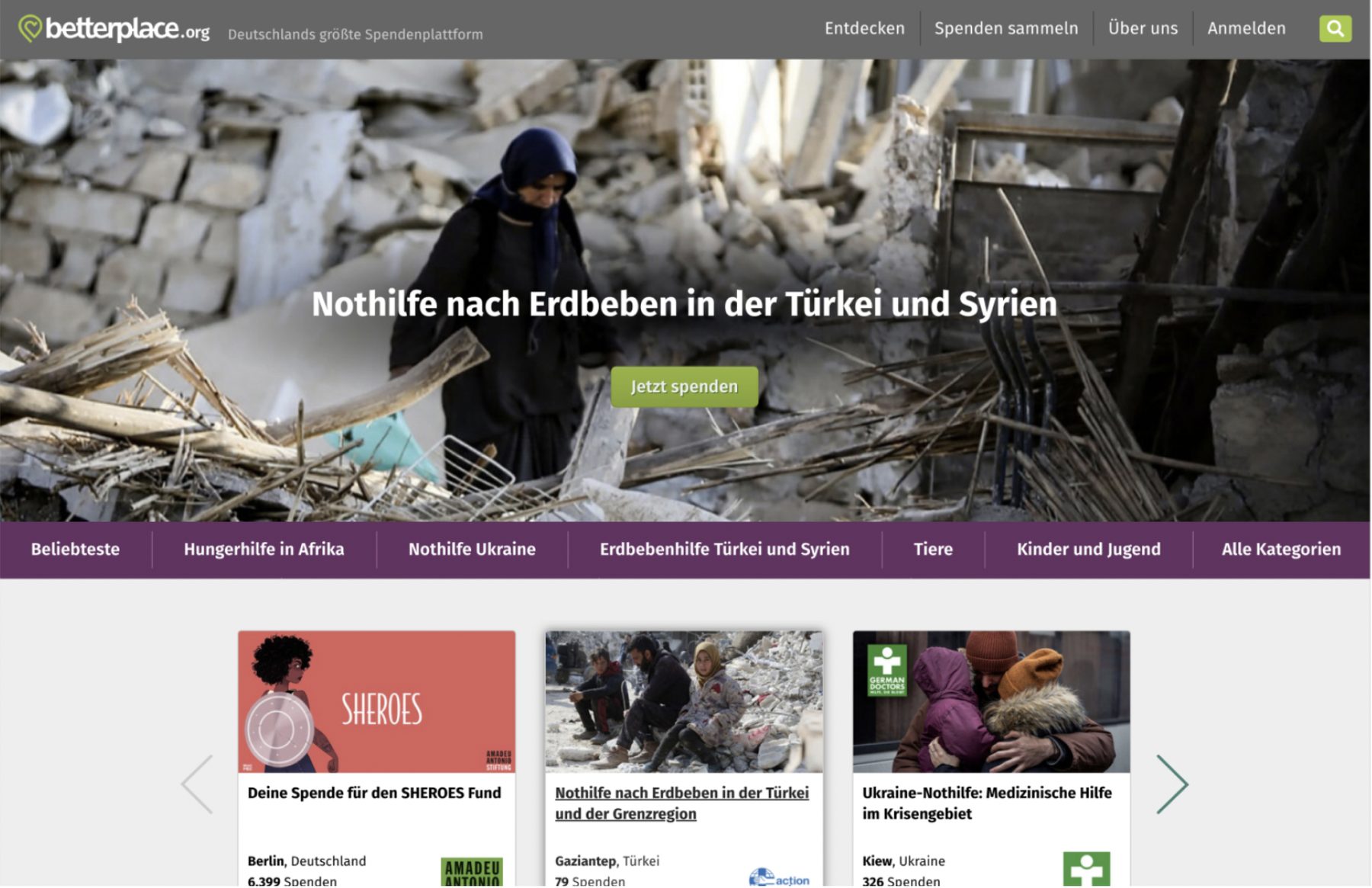
betterplace.org serves three main user functions: donating, creating a charity project for others to support, and organizing a fundraising event for a chosen charity. Our objective was to improve the desktop flow for Content Creators setting up fundraising events, a new target audience with significant potential to generate donations.
Research
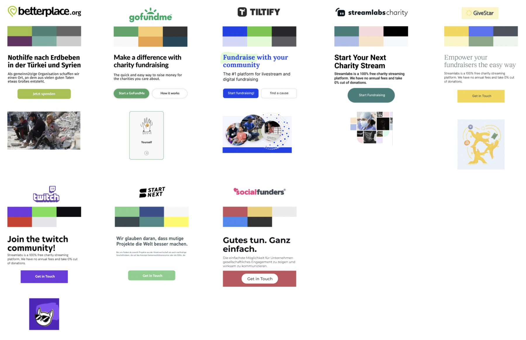
Content creators are people with social media followings from 1,000 to over 1 million, active across Instagram, TikTok, Twitter, YouTube, and Facebook. betterplace.org’s main competitors offered built-in social sharing and more intuitive, step-by-step event creation, and their vibrant, uplifting visuals resonated better with this audience.
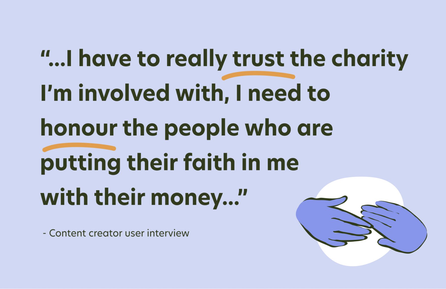
We interviewed five content creators about their routines, how they discover causes, what motivates them to fundraise, and what holds them back. Trust came out as the key factor: they need to know the charity and platform are reputable, where the money goes, and what impact it has. They feel responsible toward their followers and protective of their reputation, and they support causes that resonate with them emotionally.
Research conclusions
- Trust: confidence that the platform and the charity are credible and recognised.
- Transparency: knowing where the money goes, what fees apply and why, and how much reaches the charity.
- Tangible impact: seeing how donations are spent and the real-time impact they have.
- Aesthetically pleasing content: feeling proud to share the charity’s content and having it fit their own.
Persona and user journey
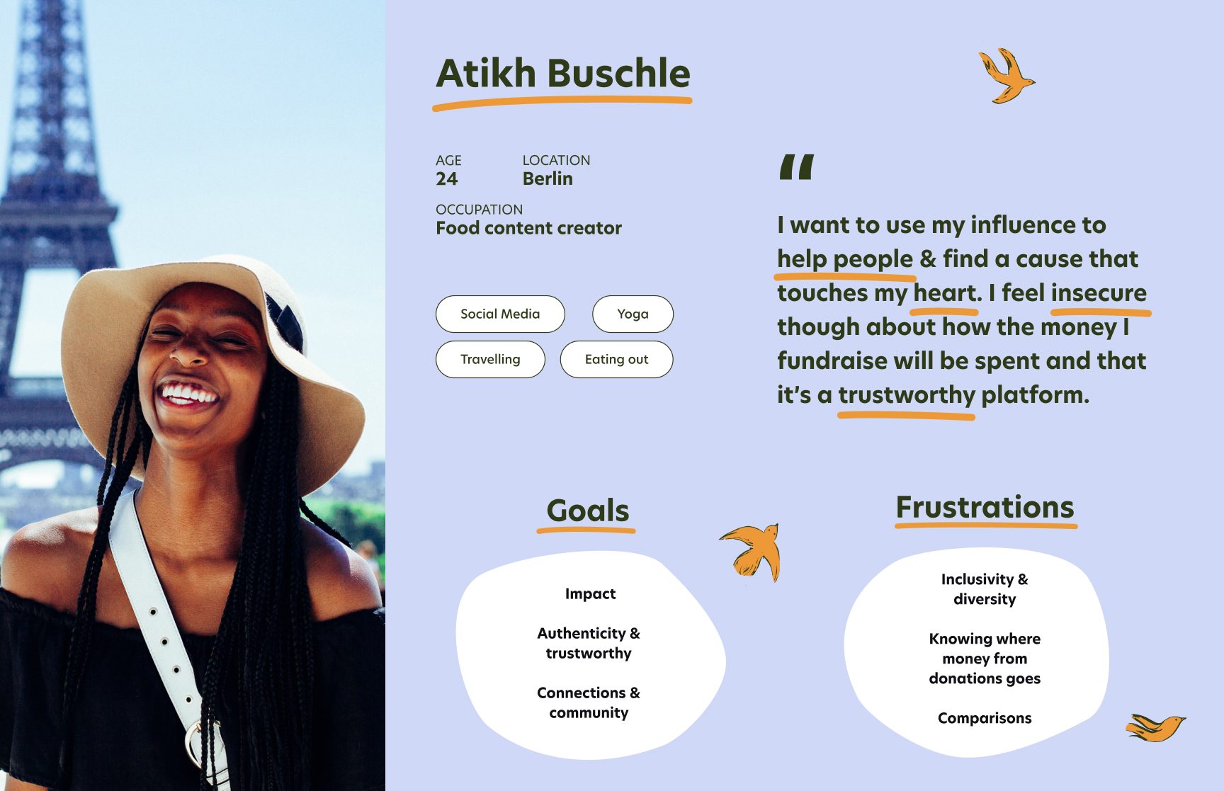
Our persona, Atikh Buchle, is a 24-year-old food and fitness creator in Berlin with over 5,000 Instagram followers. She wants to use her platform for meaningful causes, but worries about how the funds she raises will be used. When a charity she doesn’t recognize asks her to share a post, she decides not to, then feels guilty and wishes she could share fundraisers with more confidence.
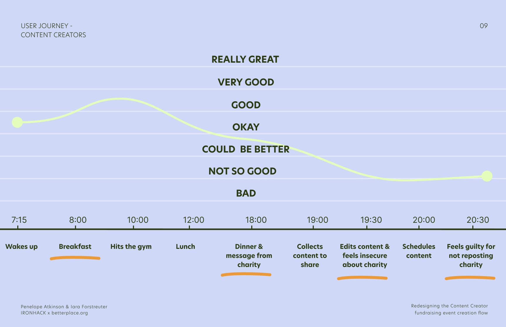
How might we…?
- How might we inspire trust from content creators by showing them where the money goes and what impact it has?
- How might we help content creators share attractive and inspiring content about their fundraising event?
We brainstormed many solutions and used a feature prioritization matrix to pick the most important and urgent ones.
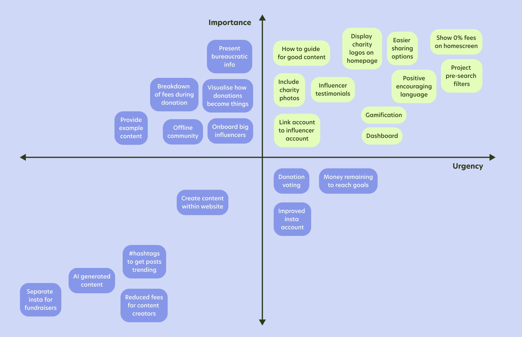
From the existing flow to a new one
The existing flow was quick, but the landing page was hidden from the homepage, there were several competing “start a fundraiser” buttons, all 15,000 projects were shown before filtering, only one project could be selected, there was no preview, and social sharing was optional and poorly integrated.
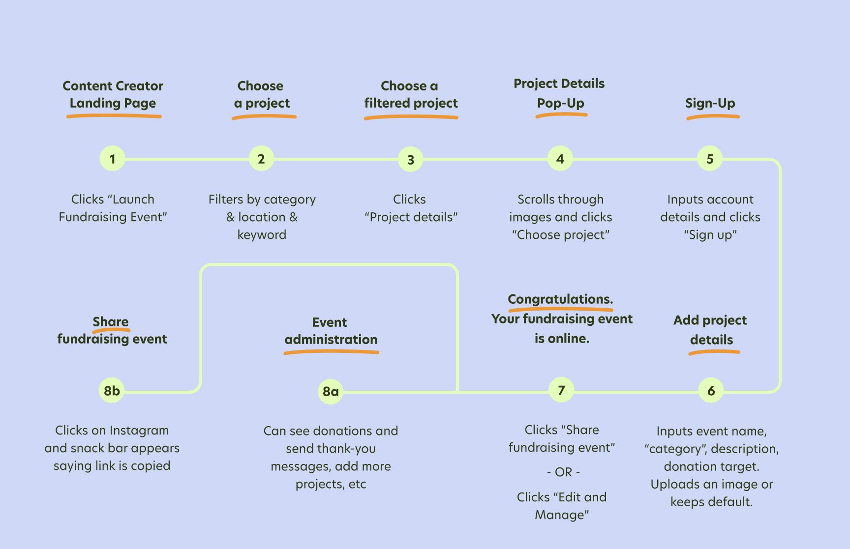
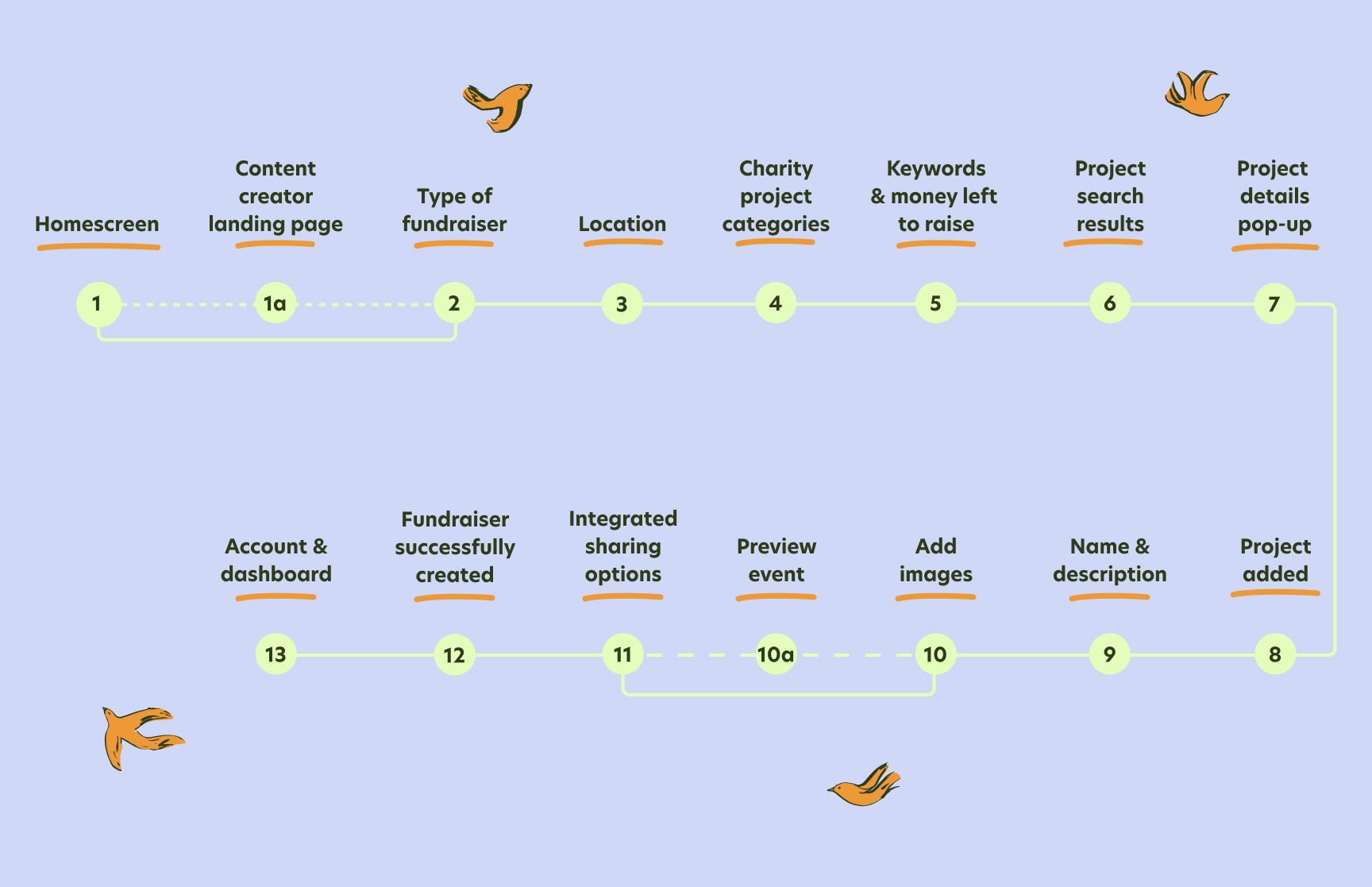
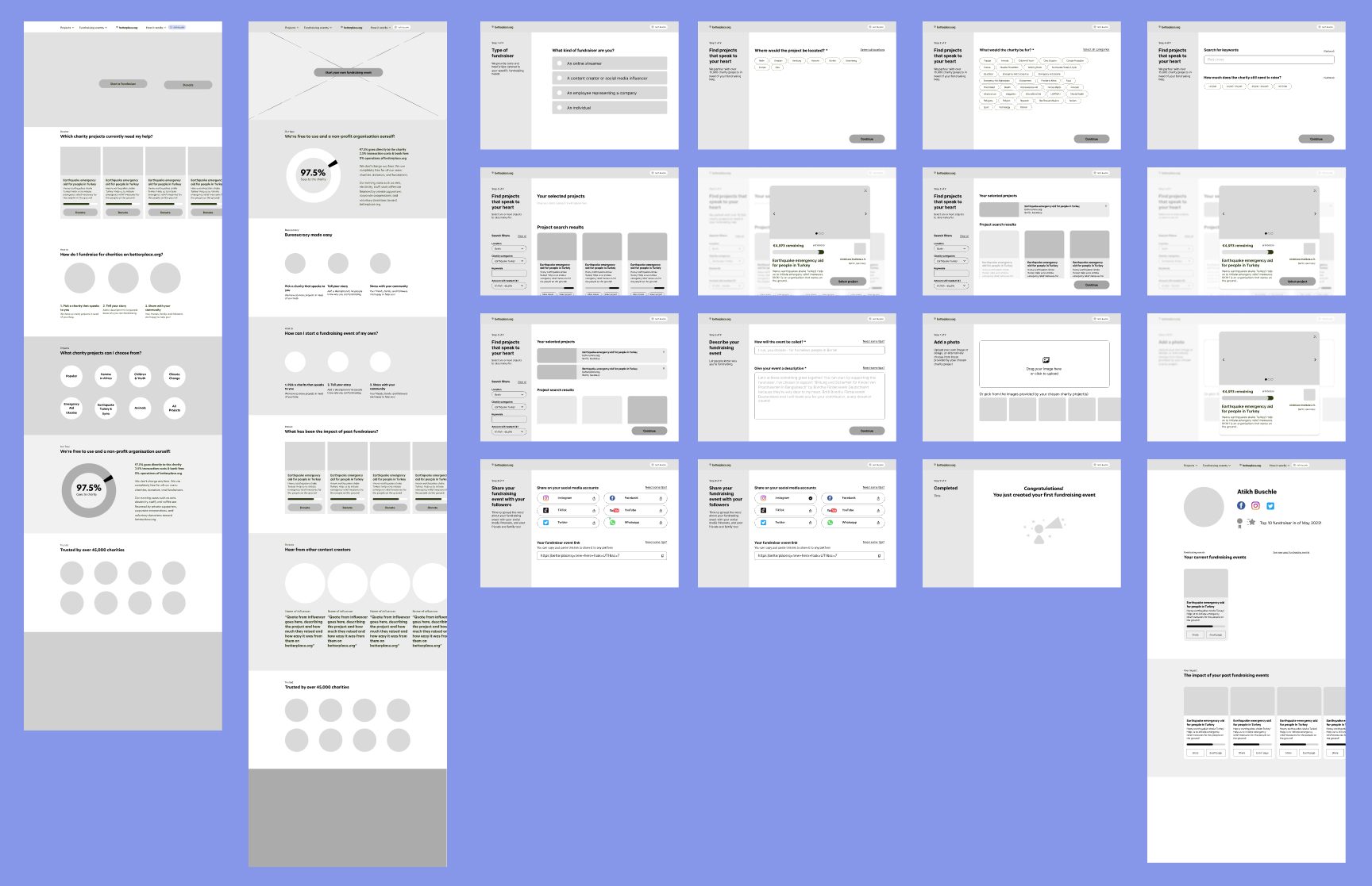
Our new flow has a few more steps, split into smaller pages so users can focus on one or two tasks at a time:
- A dedicated Content Creator landing page, reachable from the navigation, plus a “Start a Fundraiser” entry on the homepage
- One clear button to start a fundraising event
- Step-by-step filters before projects appear, including how much a charity still needs to raise
- Selecting more than one project to fundraise for
- Choosing from the charity’s images or uploading your own
- Previewing the event page before publishing
- Sharing to social media built into the flow, with a dedicated success page and a dashboard of past events
Prototyping and testing
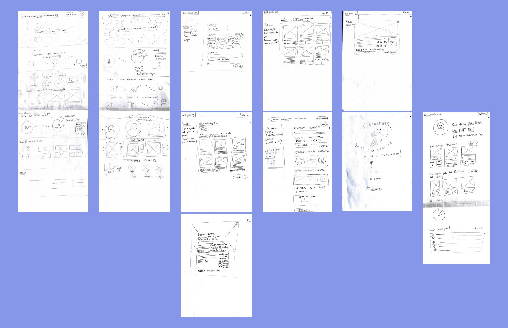
We sketched paper wireframes inspired by GoFundMe’s structured filtering, then moved to Mid-Fi wireframes in Figma. Testing showed most users clicked “Start a Fundraiser” on the homepage rather than using the menu, so we added a step to choose the fundraiser type first. Users also wanted clearer confirmation that their event had been shared, so we added a checkbox indicator and only show “Next” once sharing is done.
Brand attributes and moodboard
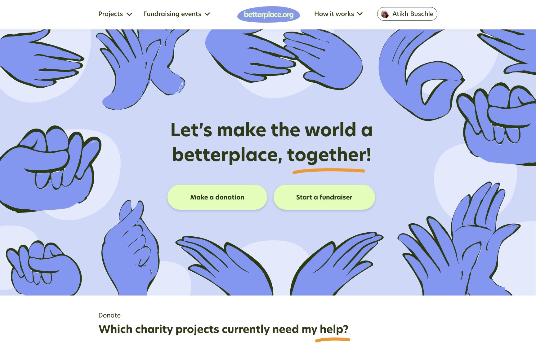
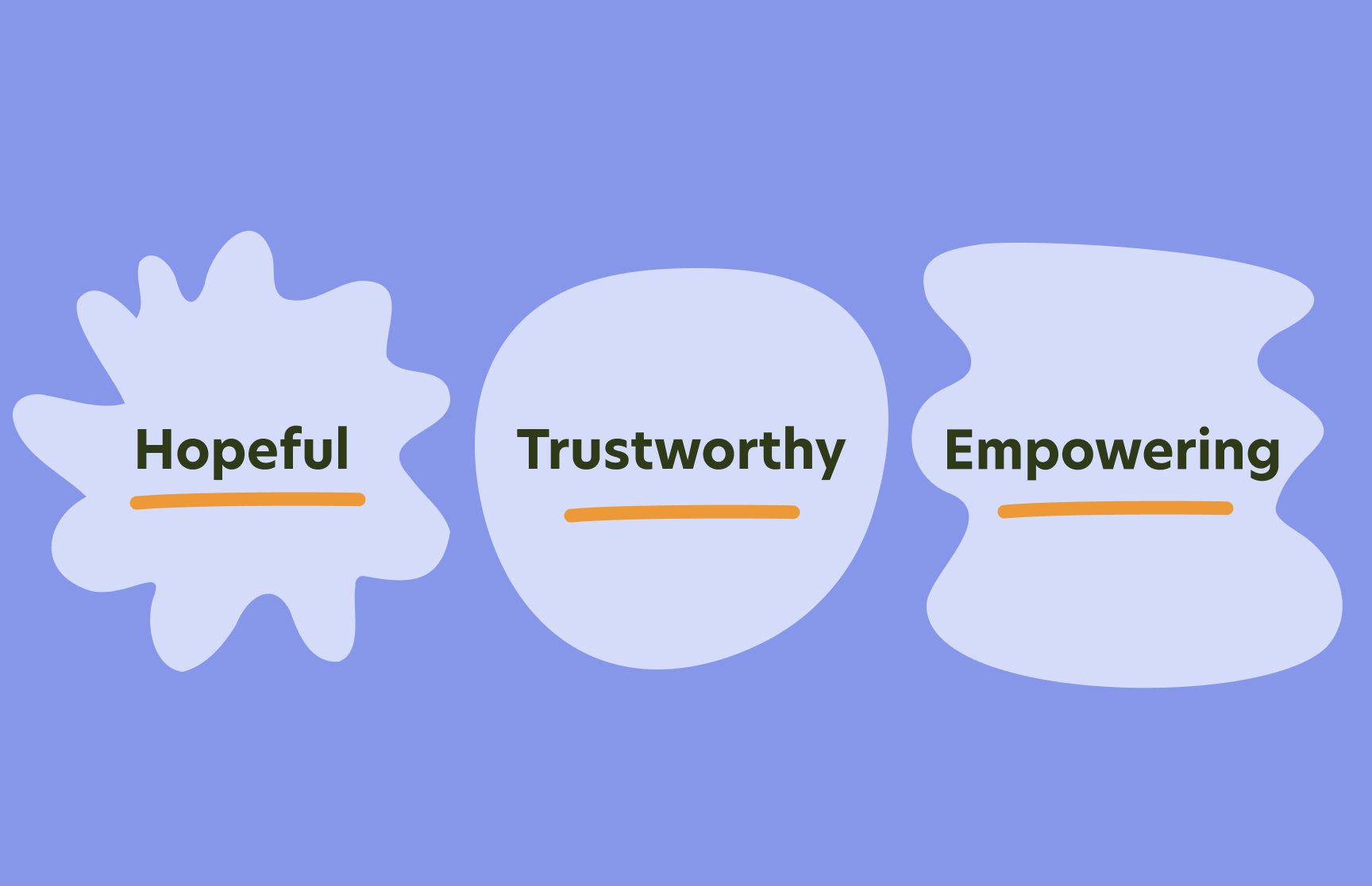
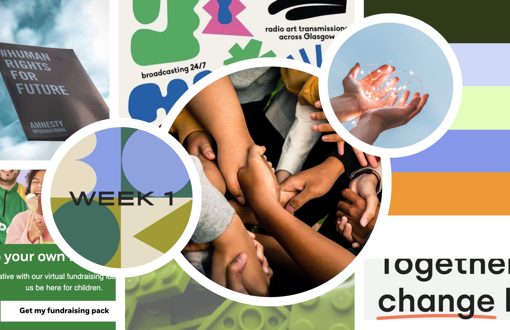
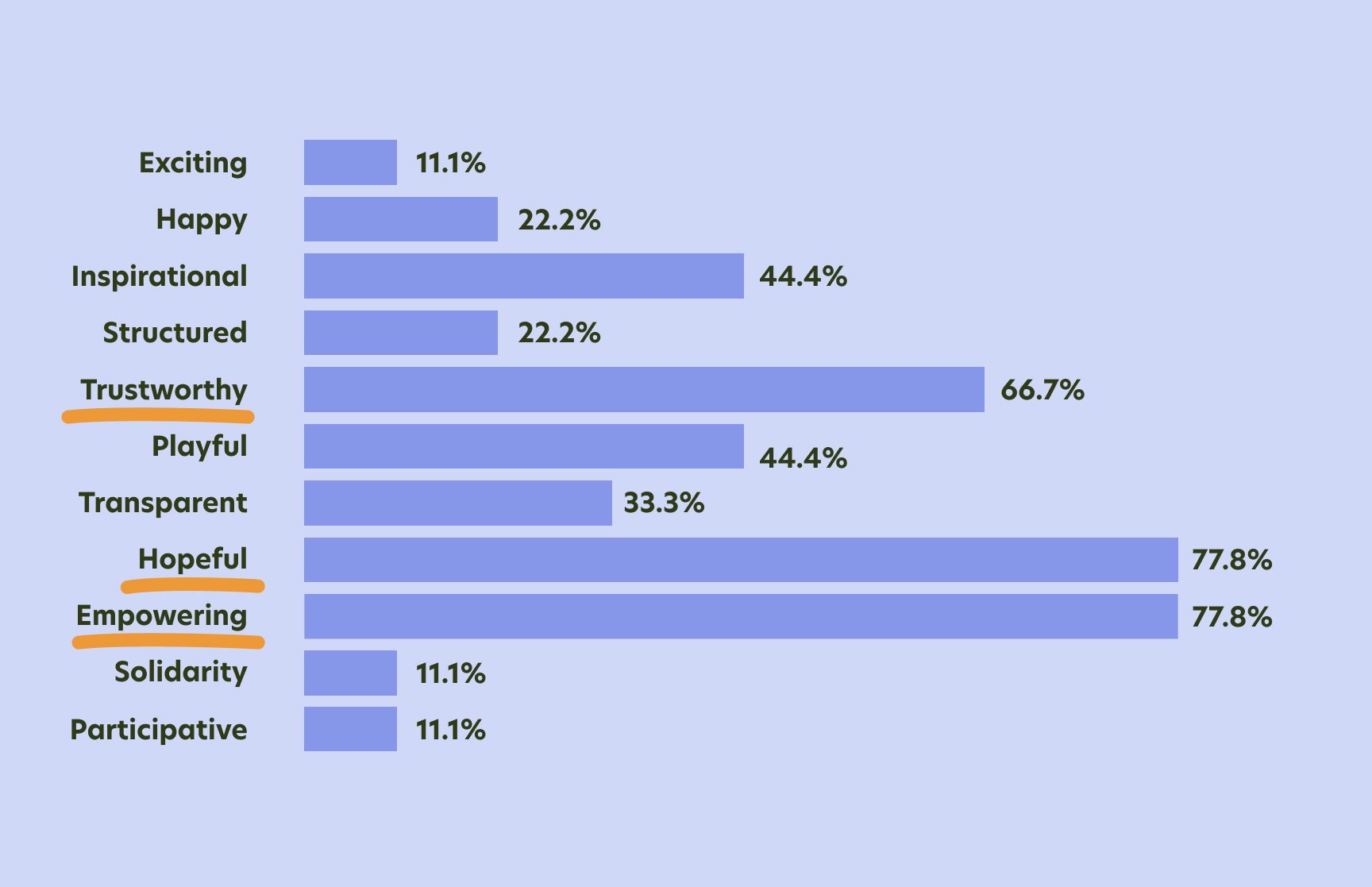
We kept “Trustworthy” and “Empowering” from the existing brand and added “Hopeful” to stress positive imagery and language. The moodboard uses hands to symbolize community, light-to-mid blues and dark greens for security, yellow-green and orange for warmth and optimism, and wide, rounded sans-serif type for trust and readability. A user survey confirmed the direction before we built the Hi-Fi prototype.
Learnings and next steps
We presented our research and prototype to the UX Designer at betterplace.org, who appreciated the user research and ideas and plans to test some of our features in future iterations. With more than two weeks we would have tested more at every prototyping stage, added a freelancer guide to the creator landing page, and shown more clearly how donations turn into real-world impact.
The project taught us a lot about managing client expectations, about proposing a more focused scope (content creators only, plus a rebrand), and about prioritization: the feature matrix kept us on the most critical, user-centred features.